YVR.ca
I had the pleasure to work on the second release of the Vancouver International Airport website. The initial release brought about a successful redesign that reflected the organization's online strategy. Informed by the roadmap and site usage, the team identified a set of features for the second release to serve the visitors better and strengthen YVR's world-class reputation.
My contributions
I was responsible for the design of the flight card and the annual report, and the enhancements to the search results and the indoor mapping. I worked closely with the original team to come up with designs that not only meet user needs but also reflects the YVR design language.
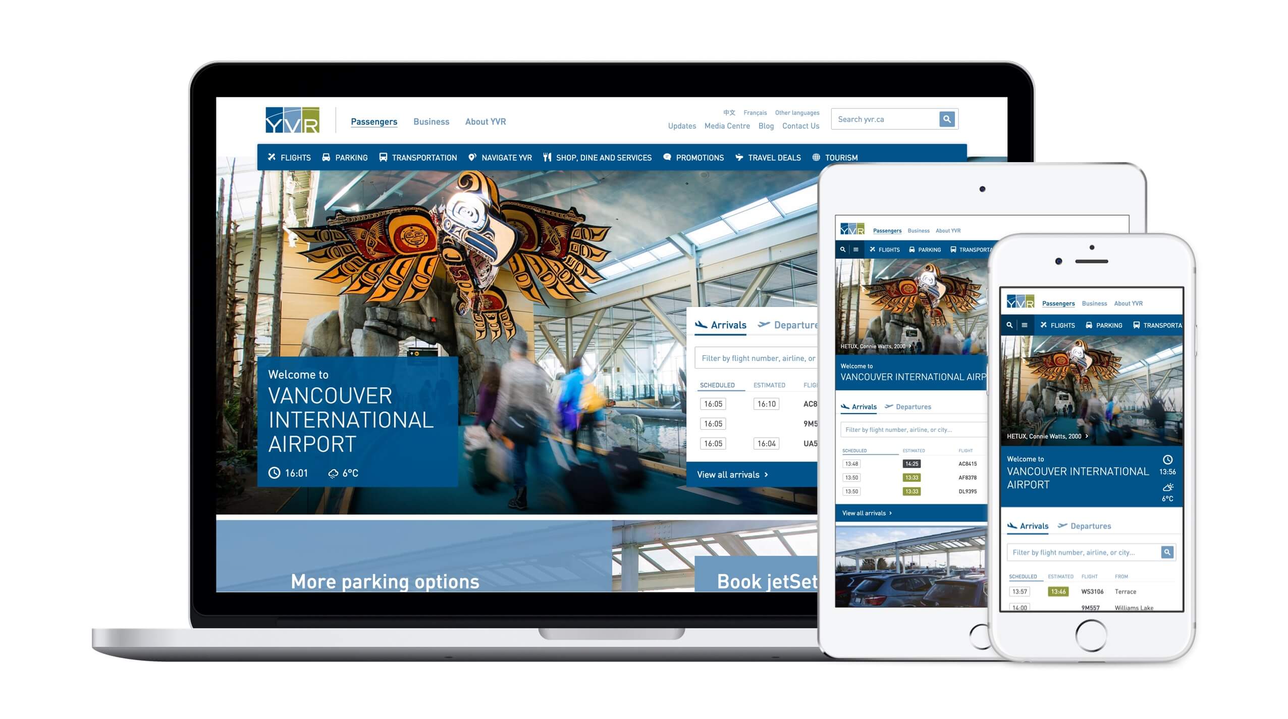
Flight cards
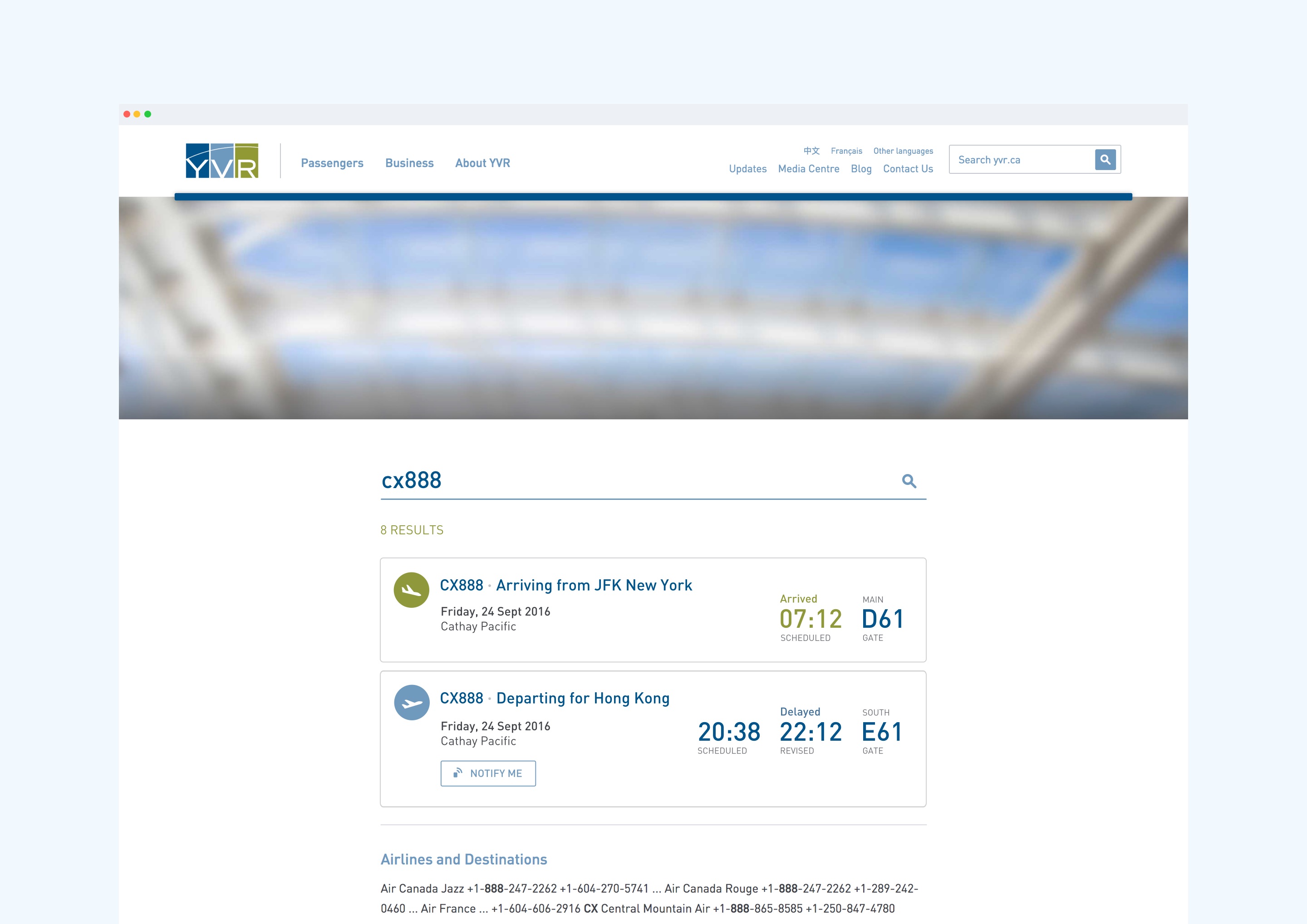
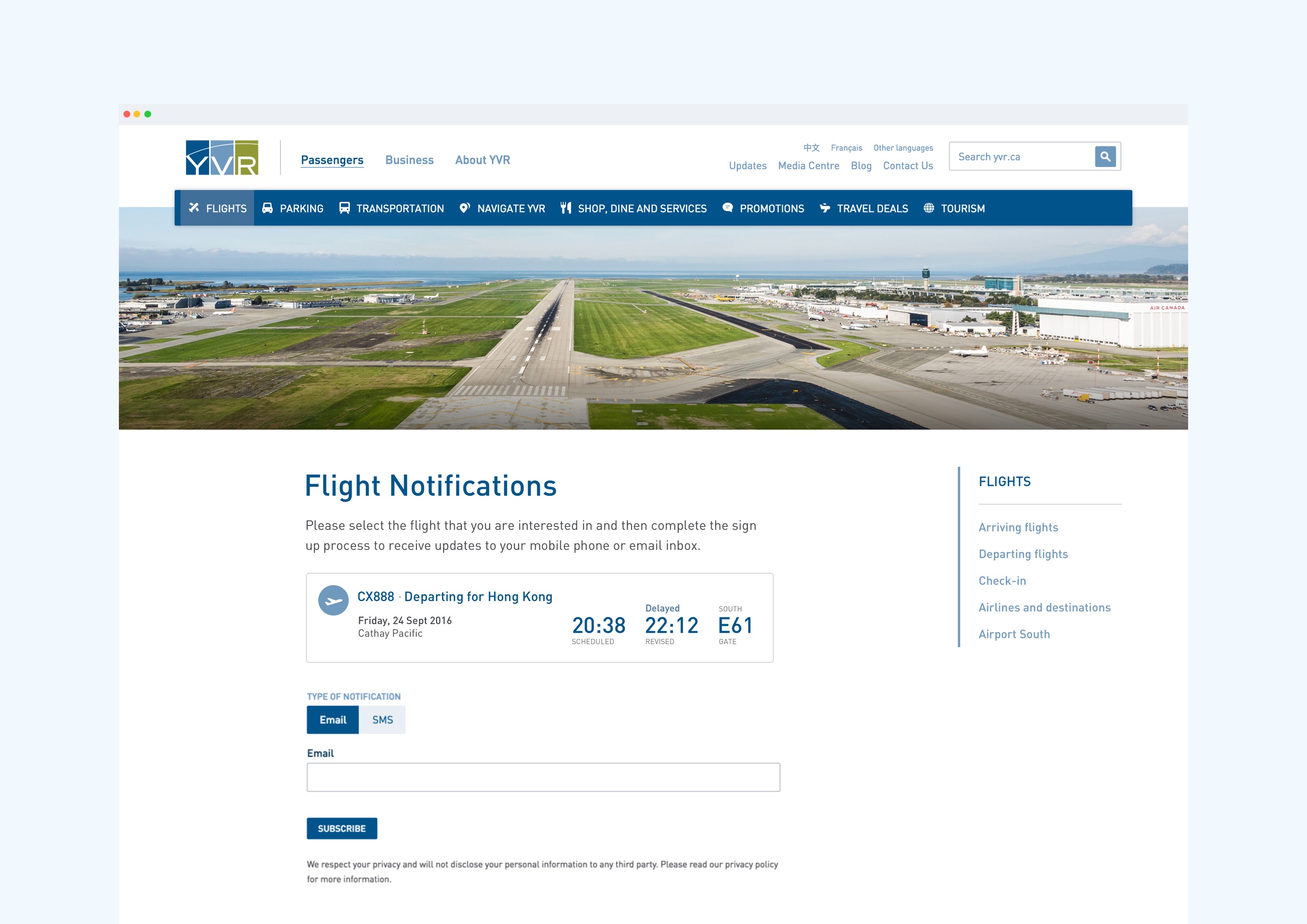
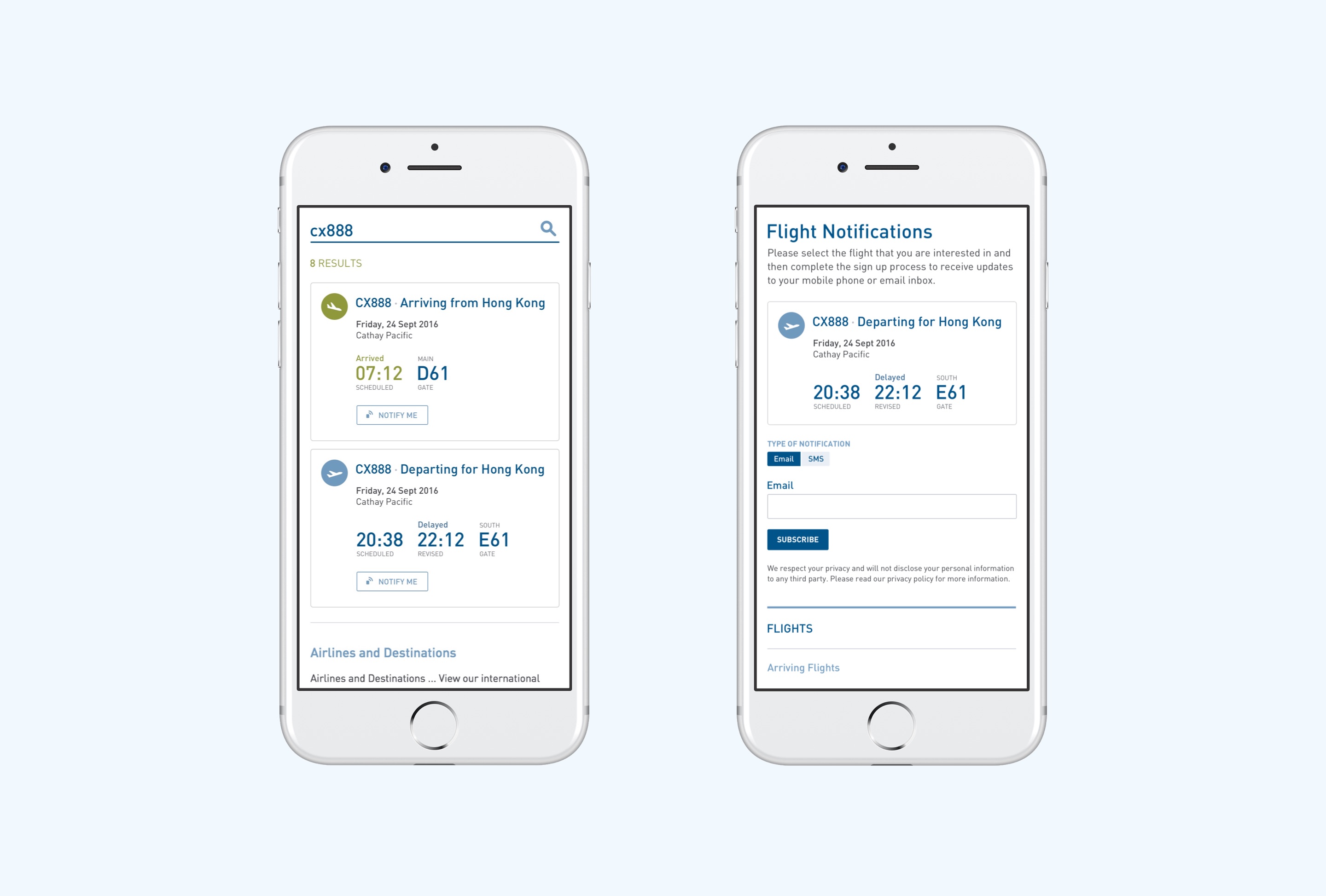
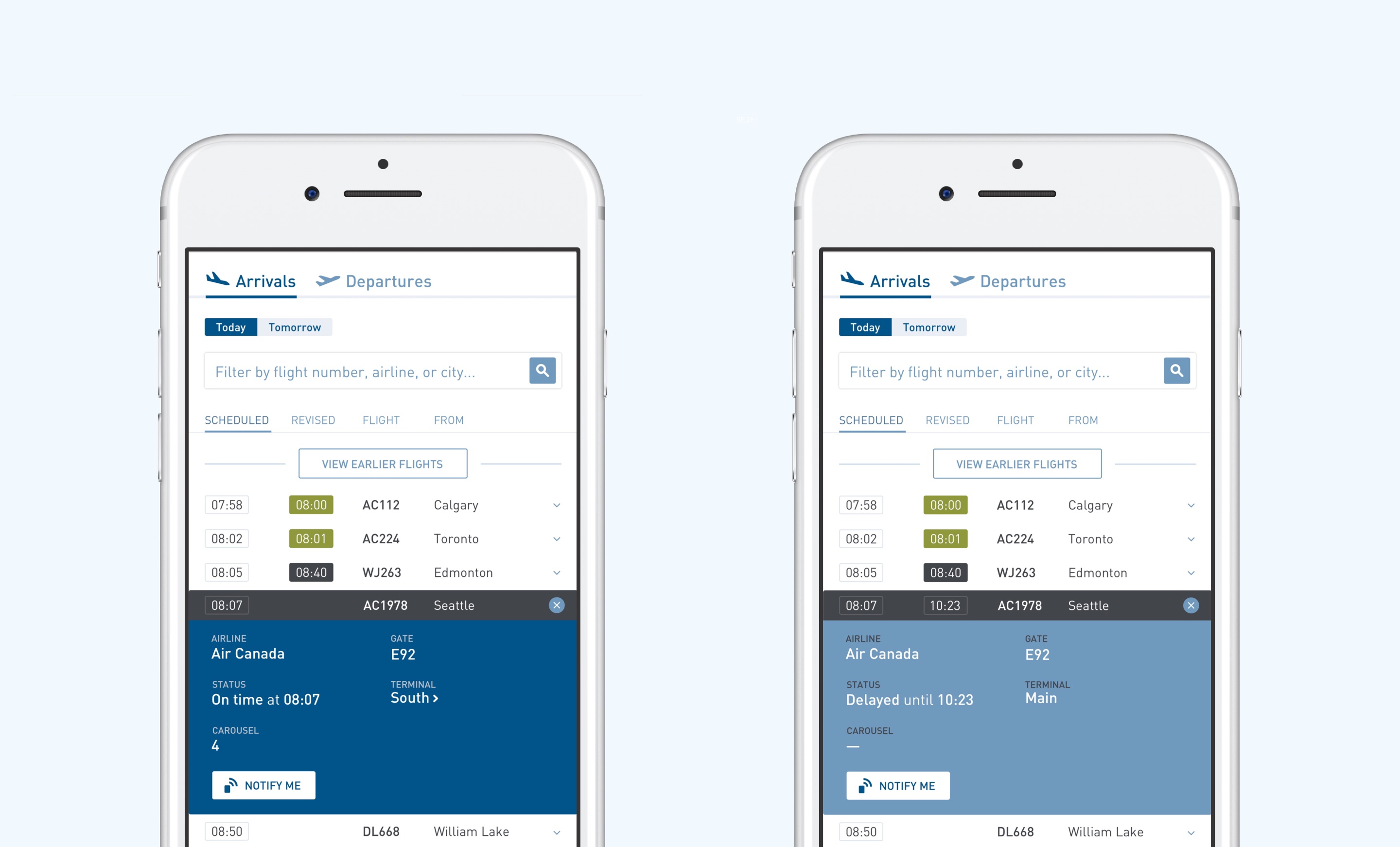
Feedback and analytics showed that users have a habit to look up flights using search. With that in mind we created flight cards for search results. The design is meant to be easily read at a glance so we grouped relevant metadata together and highlighted selected information. The resulting structure gives the users a clean and clear view of the flight.
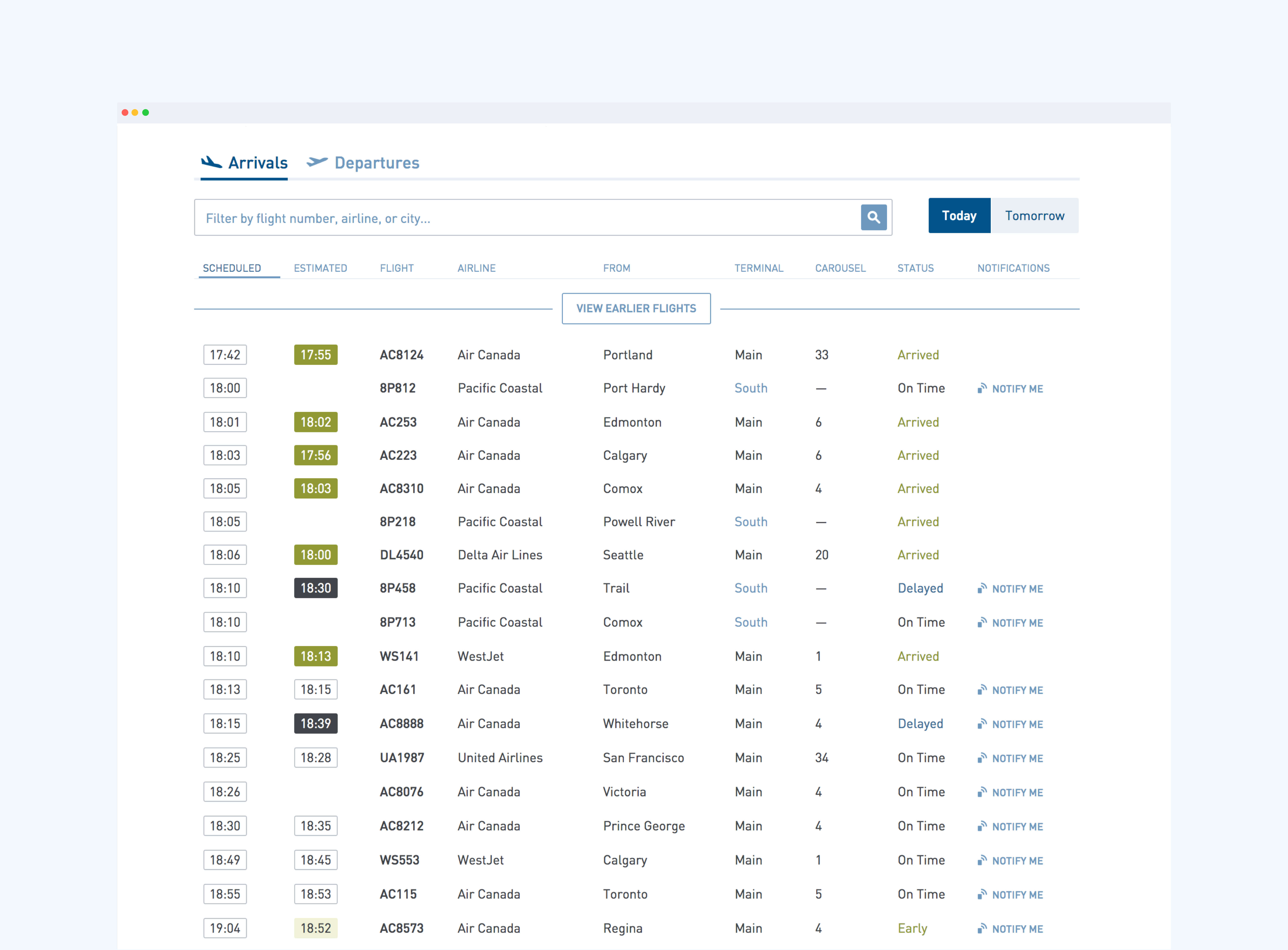
Flight table update
We extended the flight table to include carousel information and flights from Airport South. The added data provided clarity to the travellers and to the friends and family members who are picking up or dropping off. We were able to integrate the new columns while maintaining the consistency of the original design.
Outcome
It was a great experience working with the client and the team. Being able to leverage qualitative and quantitative feedback allows us to prioritize and address areas for improvements in the planning process. As the site deepens its integration with the operational data, there are going to be opportunities to create compelling experience to serve the airport visitors.