Schema
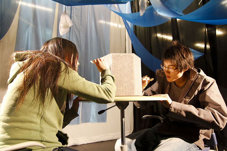
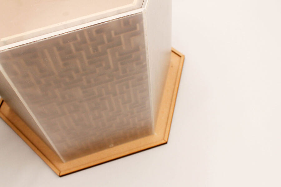
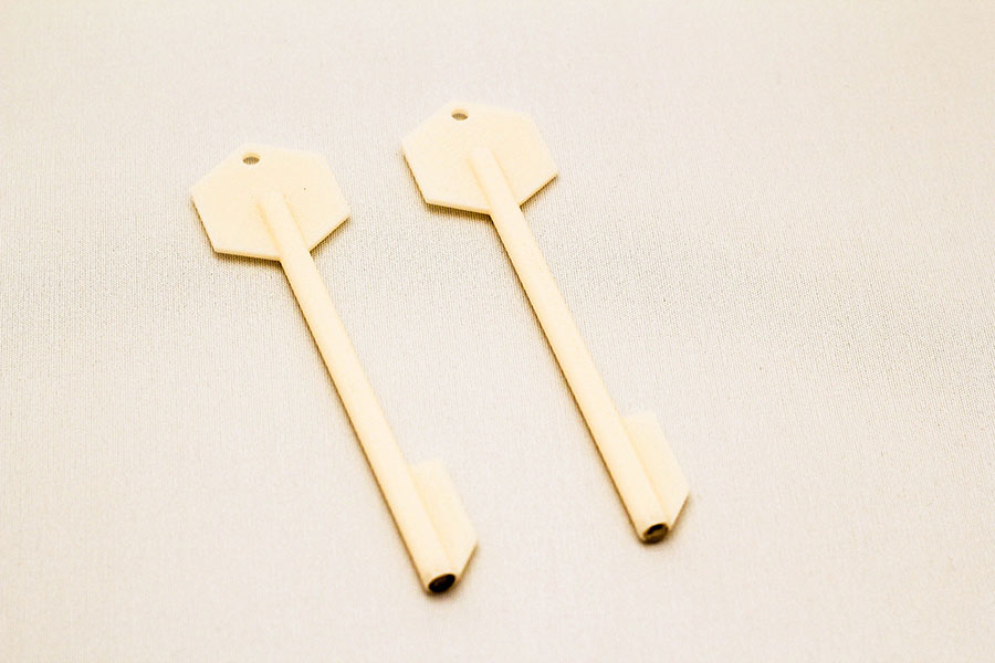
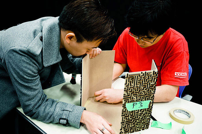
Schema is a multiplayer maze game. Each player uses a magnetic stylus to guide a steel ball through a six-sided maze, and whoever gets to the exit first wins. A translucent acrylic wall separates the players from their game piece and the maze, obscuring their vision and making the game more challenging.
My contributions
I worked collaboratively with the team on the concept development, prototyping, and the project documentations. It was a great experience on developing our iterative design skills.
Inspirations
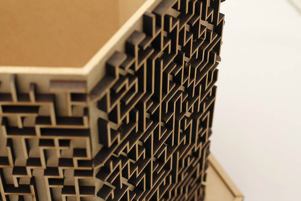
The idea behind the form came from nature and the film Inception. We were initially inspired by a scene in the movie where the city was folding onto itself. The pattern that was formed by the outlines of the buildings was mesmerizing.
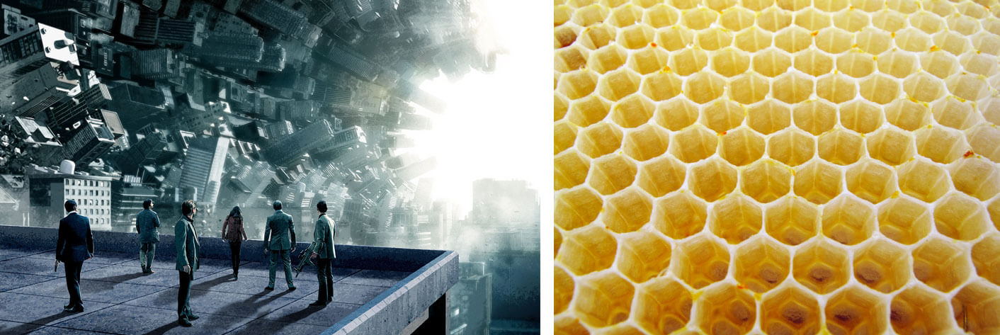
To ground this human-made architecture, we turned to nature for inspiration. The hexagonal prism serves as the backbone of Schema, unifying the sub-mazes to become a coherent whole. The polygon is a recurring pattern in nature (e.g. turtle carapace, honeycomb, and snowflake micrograph). It is a symbol of balance, union, and communication - an appropriate choice for the foundation of the design.
Prototyping process
Our approach was pretty hands-on. We started with sketching ideas for the board game. The low-fidelity prototype was made out of cardboard. It was meant to be a quick and dirty way for us to get a feel for the ideal form. We also tested with different acrylic panels and magnets to make sure that we have the right pairing.
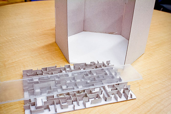
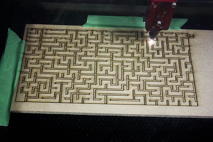
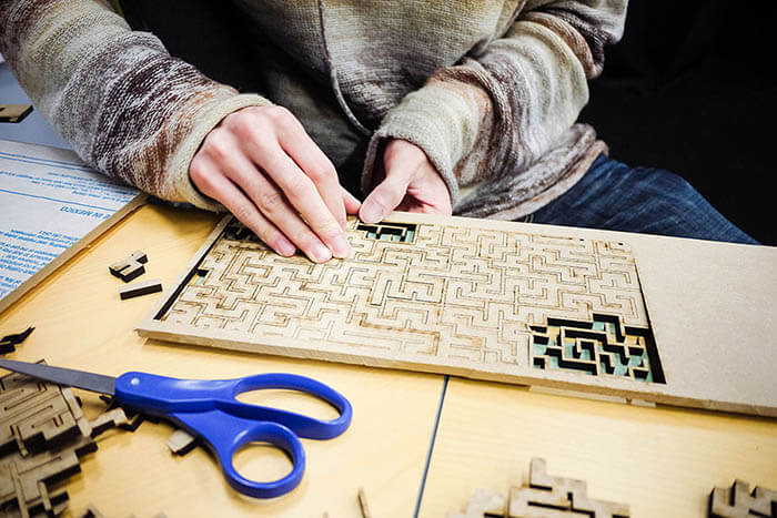
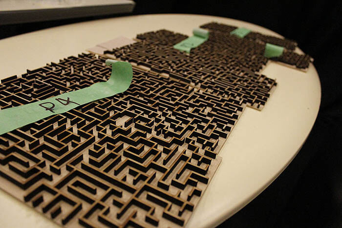
The initial prototype gave us insights regarding the size factor, choice of materials, audience's perceptions, and the possible ways to connect the 6-sided maze. It was comforting having those assumptions validated, and gave us more confidence moving into high-fidelity prototyping. We utilized Illustrator and SolidWorks to design the maze and the stylus, and then we used the laser cutter and the 3D printer to produce the forms.
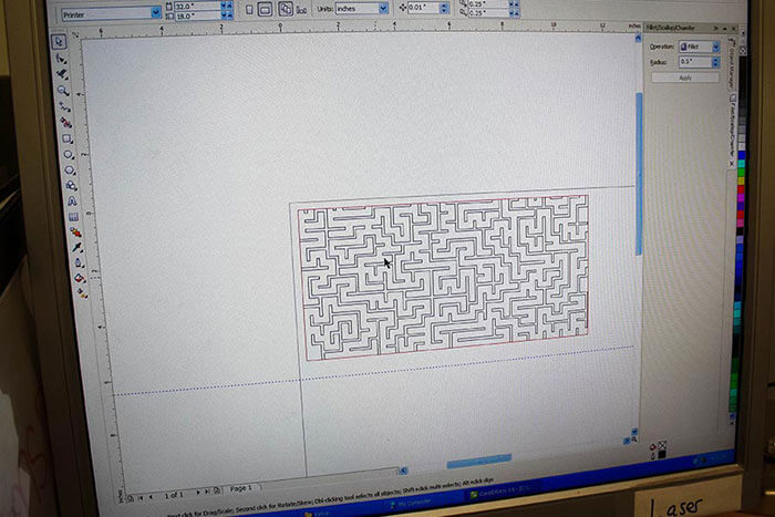
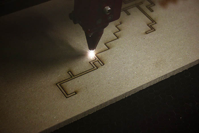
Outcome
Schema was a successful project. Our audience were captivated by the hexagon structure and found the game to be fun and engaging. The learning curve was low but it became more challenging as players started competing with each other. A common feedback was that we should consider using a more transparent outer wall to better show the visual details of the maze.